Interactive Design - Project 1

Yeo Hui Qi (0334134)
Interactive Design
Project 1
LECTURES
Week 6
In week 5, Mr Shamsul looked at our work for Exercise 4. In the afternoon, Mr. Lun took over and we told him our ideas for the topic of our website as well as what the call-to-action would be. That week, we were mostly left to our devices to design our landing page.
Week 7
Mr Shamsul checked on our progress for Project 1 and gave us 2 hours to make amends and improvements to show him again later that day. He also did a short demonstration on how to make a hamburger menu button, search icon and carousel scroll arrows. In the afternoon, Mr. Lun took over to check our work once again after some improvements were made.
INSTRUCTIONS
Project 1
We are required to design a landing page for this project.
- Decide topic of website and call to action button
- Do some research on the type of website you've chosen
- Sketch a few layouts
- Digitize in Adobe Photoshop or Illustrator.
I had chosen a website that showcases recipes from a certain chef, much like a blog. My call-to-action button would be a "subscribe to newsletter" button.
Sketches:
 |
| Figure 1.1 Layout Sketch 1 |
 |
| Figure 1.2 Layout Sketch 2 |
 |
| Figure 1.3 Layout Sketch 3 |
 |
| Figure 1.4 Layout Sketch 4 |
For the sketches I went with Layout Sketch 4 (Figure 1.4) because it was the most neat out of all the sketches I did.
Next came the hard part, which is doing it in Photoshop or Illustrator. I am not familiar with either of these software and I've only used them once or twice before. I searched for tutorial videos regarding landing page designs and eventually went with using Photoshop to follow these tutorials. That was my first mistake because I didn't know how to use the tools inside effectively and even though I tried to do some research it was a very tiring process.
My First Attempt:
 |
| Figure 1.5 Digitization done in Photoshop |
It was a very simple layout without much content because i didn't manage to finish it within the week it was given. I wasn't experienced with the software and my laptop kept running out of space while I was editing in Photoshop.
Second Attempt:
 |
| Figure 1.6 Second Attempt in Illustrator |
Eventually, I switched to Adobe Illustrator and tried again while doing more research. This screenshot is not complete because my Illustrator crashed and I lost all the images I put inside but it looked very similar to the wireframe layout on the right. Mr. Lun gave me some feedback. He said the navigation bar can combine with the website title and search bar, I should separate my author information and call to action section, and the circles for the cuisines should change to squares.
After seeing some of my classmate's designs, I was impressed and I noticed some elements that I could use in my design such as vector images that could bring different sections together and some interesting layouts. Mr. Shamsul advised me to go to Pinterest to check out landing page designs.
 |
| Figure 1.7 Sketch of Design Ideas |
I managed to find some good examples of website landing pages on Pinterest and sketched out all the ideas I got from looking at them. Some used images and blocks of colour in a way that managed to incorporate the elements of the website well. I sketched them out and implemented them in my design.
My Second Attempt Product:
 |
| Figure 1.8 Final Landing Page |
After much research and long hours making image vectors, I finally come to a point where I'm satisfied with the look of my website.
During week 8, after I made a second attempt at designing my website, I consulted Mr Shamsul for feedback on my work. He did make some comments regarding my sections not being separated properly and my elements were not aligned using grids.
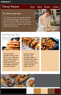
Final Product:
 |
| Figure 1.9 Final Product (JPEG format) |
This is my final product after much struggle and helpful feedback from my lecturer.
FEEDBACK
FEEDBACK
Week 6
No feedback.
Week 7
- Need to do more research
- Use the software you are most familiar with
- Author and newsletter section should separate
- Navigation bar put together with search
- Remove the arrow scroll from the cuisines
- Make it more interesting
Week 8
- Align elements to a grid system and margins on each side
Week 8
- Align elements to a grid system and margins on each side
- Make the separation of sections clearer
- For top picks section make them all aligned horizontally
- For dishes and cuisines, don't use the 2 horizontal lines, can try to make them borders instead.
REFLECTION
Week 6
REFLECTION
Week 6
- Experience
- I was nervous to show exercise 4 to the lecturer because I didn't think it was very impressive.
- Observations
- I did sketches for Project 1 and it was more difficult that it seemed.
- Findings
- I found that more margin on the side made my layouts look more neat because of the white space.
Week 7
- Experience
- It wasn't a pleasant week for me. There were many set backs and a lot of stress.
- Observations
- I discovered sources that I didn't find before when I was doing my first attempt of my landing page design. I also switched to Illustrator which was much easier to use.
- Findings
- There is so much to learn if only I know where to look and who to ask.


Comments
Post a Comment