Typography - Project 1

Yeo Hui Qi / 0334134 / B' CS
Typography
Project 1: Type Formatting and Expression
LECTURE
Week 5
There was no pre-recorded lecture to watch for Week 5 but we did watch an instruction video on how to go about digitizing our layout for Project 1. In that video, we were taught where to find the articles on the Facebook, how to create and attach the pages, and shown examples on how to express the heading of the article.
INSTRUCTIONS
For this project, we are required to combine our knowledge of type expression and type formatting to create a layout for an article. We were given 3 choices for the article and I chose "A Designer's Code of Ethics" because it was an interesting article on the impact designers have on the society. Although, through the process, I found it challenging to express the title effectively.
Sketches:
 |
| Figure 1.1 Sketch 1 |
My first sketch was messy and I didn't know how to put my ideas into the heading on paper. Once I tried using InDesign to gauge the spacing, I realized quickly that the article was in fact very long and difficult to fit inside the columns that I have drawn out on paper.
FEEDBACK
REFLECTION
FURTHER READING
 |
| Figure 1.2 Sketch 2 |
After some self-evaluation, I could really see this sketch was just too plain and boxy.
 |
| Figure 1.3 Sketch 3 |
In this sketch, I focused more on how I want the body text boxes to be placed. I also did minimal styling of the heading and left that to do digitally with Illustrator.
 |
| Firgure 1.4 Sketch 4 |
For sketch 4, I was sure on which style of heading I wanted for it where "Designer's" was emphasized with serif font. The staircase-like placement of the text boxes was really inspiration from the examples shown to us and I found them interesting.
Experimenting with the Heading:
 |
| Figure 1.5 Heading Type Expression |
These are all the heading expressions I experimented with using Illustrator. I tried changing the font to better represent the word and tried emphasizing different words using bold and italic type faces. From the examples shown to us, it was difficult for me to integrate the symbols seen in the upper right artboard.
| Figure 1.6 Heading Type Expression |
After more experimenting I was finally satisfied with the outcome of this heading. I added 1's and 0's in Serifa inside the "O" of code to express its meaning. I used Futura and New Baskerville type families for the heading.
My First Attempt:
 |
| Figure 1.7 Attempt Layout 1 |
 |
| Figure 1.8 Attempt Layout 2 |
 |
| Figure 1.9 Attempt Layout 3 |
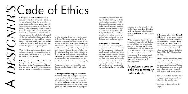
The Final Product:
 |
| Figure 1.10 Final Product (JPEG Format) |
Figure 1.11 Final Product (PDF Format)
FEEDBACK
General:
- Update feedback sheet
- Try out more than 1 layout
- Title must be expressed with meaning
- Try not to have text in the middle margins of the 2 pages
- Instead of having binary code inside the "O" of code, try changing the I's and O's in the heading into 1's and 0's.
- Use 3 columns for better line length, 2 seems too wide.
- Don't use too big gutter space between columns, keep it at 5mm.
REFLECTION
Week 5
- Experience
- The lecturer gave a short demonstration on Project 1 and then moved on to review student's work for Exercise 2.
- Observations
- When doing project 1, I was unsure of how to start expressing the heading and wasn't sure how to place the body of text so that it flowed nicely.
- Findings
- It took a lot of experimenting and exploration to figure out how I wanted my layout to look.
Week 6
- Experience
- I was very nervous to show my work because I personally wasn't too impressed by it and struggled with the expression of the heading.
- Observations
- I made a mistakes with gutter spacing and the lecturers gave be a few pointers.
- Findings
- I noticed I'm quite uncomfortable having too much white space in my layout and I feel it looks too plain despite what Mr. Vinod's reassurance that it looks okay.
FURTHER READING
Week 5
Excerpt from: First Principles of Typography
Author: Stanley Morison

Typography may be defined as the art of rightly disposing printing material in accordance with specific purpose; of so arranging the letters, distributing the space and controlling the type as to aid to the maximum the reader's comprehension of the text. Therefore, any disposition of printing material which, whatever the intention, has the effect of coming in between the author and the reader is wrong. Even dullness and monotony in the typesetting are far less vicious to a reader than typographical eccentricity or pleasantry.
The laws governing the typography of books intended for general circulation are based first upon the essential nature of alphabetical writing, and secondly upon the traditions, explicit or implicit, prevailing in the society for which the printer is working. National tradition expresses itself in the varying separation of the book into prelims, chapters, etc., no less than in the design of the type. But at least there are physical rules of linear composition which are obeyed by all printers who know their job.
Week 6
Excerpt from: Advertising Design and Typography
Author: Alex W. White

The most popular way to improve advertising has been to buy advertising and design annuals, and copy or be inspired by the ideas that look best. This is based on opinion and whim, not understanding or thought about what would most effectively get a particular idea across.
The lifespan of an ad is brief: an issue, a program, a day, a week, a month, a season. Few ads are in use a year after their introduction. Advertising must be timely and of-the-moment to be seen and acted upon: reders want to be current and well-informed. Advertising must possess vitality and exuberance. Advertising design encompasses six more or less equally-weighted disciplines with which an art director must be proficient, or at least familiar. Graphic design covers the same disciplines, but wuth a greater emphasis on typography, photography and illustration.


Comments
Post a Comment