Design Principles - Exercises

Yeo Hui Qi / 0334134 / B'CS
Design Principles
Exercises
VISUAL RESEARCH
Exercise 1 - Contrast and Gestalt Theory
The research that I did was to get a better understanding of contrast and Gestalt Theory as design principles. Contrast is defined as the arrangement of opposite elements and effects including colours, textures, and shapes. Contrast can be used to create variety, visual interest and drama in an artwork. In the example below, it's shown Caravaggio's Crucifixion of St. Peter (1601) created a scene of action by contrasting light and dark colours as well as directional lines.

Gestalt Principles on the other hand are principles or laws of human perception that describe how humans group similar elements, recognize patterns and simplify complex images when we perceive objects. The principle I've chosen to work with is the principle of closure (reification) which is the completion of an image by filling in gaps between shapes as shown in the example below.

Exercise 2 - Emphasis and Balance
For this exercise, I got most of my inspiration from games and their characters. First, emphasis. I explored main characters from games that really stood out from their environment. Many of them were games like Little Nightmares, Limbo and Unravel.


Exercise 3 - Repetition and Movement
For repetition, I found a lot of pattern type designs on Pinterest for exploration of the concept. I was really interested in the mandala pattern because it seems to weave in and out of itself and was almost hypnotizing. A lot of the patterns seemed to have a 3D effect and I thought that was interesting.


I didn't really do any visual research for movement since I was clear on what I wanted to do since it was something that come from previous experience with a certain pattern or design.
Exercise 4 - Harmony and Unity
For harmony and unity, most of the images I found that have these principles seem to be related to the sea and sky. It works because of the different shades of blue.


IDEA EXPLORATION
Exercise 1 - Contrast and Gestalt Theory
For contrast and Gestalt Theory, I explored many concepts that appear in nature. For contrast I knew I wanted to make a pattern with a separate element that stands out. In the picture below, I sketched concepts for Contrast on the left and Gestalt Theory on the right. For contrast I explored palm leaves, patterns on seashells as well as rays of sun. For Gestalt Theory, I knew I wanted to use closure because it was the most interesting principle in my opinion. So, I sketched out a few animals including a turtle and a fox. I also sketched out an optical illusion that could work to show the principle of closure in Gestalt Theory.

In the sketch below, I explored contrast and gestalt theory ideas more. The top half of the page is Contrast and the bottom half is Gestalt Theory. I sketched out rain falling and that was what my final outcome was based on. The other sketches for contrast I made was just symbols I found online that I liked and tried to incorporate into a pattern to show contrast but it didn't look like how I expected it to and so I didn't use that idea. And the bottom half where I sketched for Gestalt Theory, I explored the idea of making bees which is also another animal I can make to show closure principle. But I went with the fox idea I had previously.

For emphasis, I explored the idea of a main character and how they always stand out from the crowd. I also sketched out the character with a fire for a soul but it was hard to emulate a glowing effect with just colour pencils so I avoided that. In the sketches below, you can see many characters resembling ones I found from games that I've seen.

For balance, I sketched out some abstract shapes since abstract art was what reminds me most of asymmetrical balance or balance in general. But the main idea was still the tree with the moon behind it. From listening to feedback, abstract art did apply the principle of asymmetrical balance but it also didn't have much meaning behind it. I think trying to convey a message to the viewer is also important.

Exercise 3 - Repetition and Movement
For repetition, I was inspired by these 2 pictures I found. I like how the one on the right has shadows that give it depth and reminded me of peacock feathers and the one on the left is almost hypnotizing. So I made a bee concept with the shapes on the left and turned it into a honeycomb shape by isolating a few hexagons.


For movement, I didn't really have a reference or sketch. The idea came from a weird doodle me and my friends did back in high school. The design starts out with triangles that fill the page and then I would draw lines along the inside of the triangle circling towards the middle. The pattern must be drawn in a particular direction to create the swirl illusion. Below is the sketch and test with water colour.

Week 4 - Harmony and Unity
For harmony, I based my idea on the reference images shown in the visual research section. I think a lot of students did the sea and sky combination but I did check with the lecturer and she said mine was different style compared to others. In my sketch, I incorporated whales in both of them. The first one is in the sea and the second one is in the sky. Altough the lecturer did prefer the one with the sea and sun shine in it.

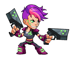
For unity, I had a few sketches seen in the bottom half of the image above. The first one was paint or blood splatters. The second one I was imagining anime character's hair that have different colours but they still remain as one thing which is hair. I think the idea stemmed from more pop art cultures with bright colours. I got my inspiration from a Brawlhalla, a game. One of the characters named Ada has very bright pink hair with different shades shown below. The last idea was a plate of spaghetti because I thought the colours in a plate are also important parts of the presentation of a meal and it brings all the flavours together.
Exercise 5 - Symbol, Word and Image
For symbol, there were many ideas for abstract symbols. 2 of my ideas were for forest fires which are the mountains and antlers, 1 for testicular disease which is the cherry at the bottom right and another one for a poison effect which is the one on the bottom left. Most are warning signs. The poison one came from a game but I think it can be used as a warning for radioactive areas.

For word and image, I chose to go with a cozy theme. This is solely because of the interior design magazines I have at hand. The idea was to incorporate a sofa and flowers around it. The typography will just be the word cozy sitting on the sofa.

FINAL DESIGN OUTCOME
Exercise 1
The image below shows my final product for Contrast. I made a pattern with the rain and added an umbrella in the middle that contrasts with the rain drop shapes. For my process I drew a grid to make sure the rain was placed systematically to make a pattern and I made sure all of them were relatively the same size. The umbrella is also made up of 6 shapes that are different from the rain drops and to show more detail.

My final product for Gestalt Theory was a fox. I first sketched out the shape of the fox on black paper and cut out individual shapes. I purposefully left out the body to show more of the concept of closure in Gestalt Theory. The head and tail was enough to show it was a fox and the small spaces between the shapes also helped visualize the places where there were different colours in a fox's face and tail.

Week 2 - Emphasis and Balance
The image below shows my final product for Emphasis. My idea behind that was emulating how a main character usually stands out from the crowd so I made sure the character had more detail and brighter colours compared to the crowd behind it.

The image above is my final product for symmetrical balance. At first I mistook it as asymmetrical and was corrected later on by the lecturer. For this landscape I drew, the image is balanced on either side of the center axis with the moon and clouds in the background with the tree in the foreground as the center anchor.

The story behind my piece for asymmetrical balance was like a bird in a cage, but my cage was made of glass that was still solid like the bricks in the top left. The bird was free to look around in the would outside but was not free to fly away, unlike the bubbles on the bottom right. The glass cage was also made to look like an ornament as if the bird's purpose was only for decoration.

Exercise 3 - Repetition and Movement
For repetition, I made a hive pattern made up of 3 parallelograms each. And each parallelogram was coloured black and yellow to resemble bees. I found it very difficult to maintain the size and angles of the parallelograms when drawing it in pencil. I used water colour for this piece.

For movement, I used the pattern shown in my idea exploration. The red was supposed to show depth of the swirls like a spiral staircase.

Exercise 4 - Harmony and Unity
The first picture shown below is the final product for harmony. After a lot of feedback from the lecturer, I added some patterns and textures to make the picture stand out more. Miss Maria showed me many pop art pictures for reference. And I think adding different shades with the stripes added a lot of the character seen in the reference images shown in the visual research.

Next is my piece for unity. I went with the colourful hair idea and I think it turned out good. You can tell that it's hair on a head and the shades of colour correspond with light and shadows.

Exercise 5 - Symbol, Word and Image
For this exercise I created an abstract symbol that represented a warning sign for forest fires. It is melting antlers with a mountain in the middle. The antlers are coloured red because red is used a lot in warning signs whether abstract or not are ingrained in our instincts that red means danger. The mountains remained green just to show that it involves nature or a mountain top.

For word and image I cut and paste from many interior design magazines that I have at home. The goal was to make a cozy outdoor-like space which I managed to find a good picture of a sofa and a lot of plants. As for the word cozy, I cut them out of different patterned pages, typically where plants, water or the sky are present just to keep the sense of serenity. After feedback on my sketch, the lecturer also suggested that I make the word cozy more animated as if jumping on the sofa.

REFLECTION
Week 1
This week, we were asked to watch the lecture video before class and then asked to start with exercise 1. I think by doing the exercise, I managed to gain a better understanding for contrast and Gestalt Theory. I had fun sketching out ideas and exploring visual inspiration from nature.
Week 2
We showed our work for contrast and Gestalt Theory, I think I did an okay job. There were also many people to made use of the closure principle to express Gestalt Theory. I did not expect the lecturer to question about our opinions on Gestalt Theory and how it helps us in design but I tried my best to answer accordingly.
Week 3
This week was okay. I only had trouble understanding symmetrical and asymmetrical balance which was later clarified to me. I think using colour pencils didn't give much wow factor to my pieces because some are too light for emphasis and balance.
Week 4
For repetition and movement I think I enjoyed the spiral patterns the most even though it took up a lot of my time. Using watercolour was better for me compared to the previous week because the pigments came out better.
Week 5
This week was harmony and unity, I came up with the ideas for it pretty quickly. I realise sometimes I don't take the time to do much visual research before jumping in to the ideation.
Week 6
This week I found the task quite interesting. It's hard to come up with an idea for an abstract symbols since most have to be learn so I tried to go with things that are more instinctual like colour usage in signs. The word and image one on the other hand was done based on what kind of magazines I had at hand.


Comments
Post a Comment