Illustration and Visual Narrative - Exercises

28 Aug 2020 - 25 Sept 2020 (Week 1 - Week 5)
Yeo Hui Qi / 0334134 / B'CS
Illustration and Visual Narrative
Exercises - Vormator Challenge and Landscape Illustration
LECTURES
Week 1
Character Composition
EXERCISES
Exercise 1 - Vormator Challenge
Exercise 2 - Vector Landscape Illustration
REFLECTION
Exercise 1
Week 2
Chiaroscuro
Week 3
Composition
Week 5
Perspectives
Week 6
Rhythm and Movement
EXERCISES
Exercise 1 - Vormator Challenge
For the Vormator challenge, we were given 8 shapes to work with to create a character for a trading card like Pokemon or Yu-Gi-Oh card games.
 |
| Figure 1.1 Vormator Shapes |
I first started by ideation by sketching using all the shapes. I tried to make mustaches, scales, wings, cobra patterns and fish-like creatures. But my favourite was still the hourglass shape I made using 2 badge shapes and chevron shaped for wings and fire inside. I chose that one because I thought it had the most character out of all the sketches I made.
 |
| Figure 1.2 Vormator Challenge Sketch |
This is the outcome after I digitized it in Illustrator. I also experimented with a few colours before choosing the green one.
 |
| Figure 1.3 Character Colour Palette |
 |
| Figure 1.4 Final Colour Selection |
Next, I proceeded to draw the landscape for the trading card. I also made sure that my character still contrasted well with the background.
 |
| Figure 1.5 Trading Card Lanscape |
 |
| Figure 1.6 Trading Card Landscape with Character |
This is the final outcome after I put it all in the trading card frame. I used a psychic pokemon card template and added the name and origin / narrative for my character.
 |
| Figure 1.7 Final Trading Card Design |
Exercise 2 - Vector Landscape Illustration
First, I started by looking for references. I then made sketched of my ideas based on the references in Illustrator. In Figure 2.1 you can tell that I've already selected a scene to work on which is the fortune teller's tent. But the main focus is the references and their corresponding skectches.
 |
| Figure 2.1 References and sketches |
Here is a more focused picture of my sketches. There were flower fields, city scapes, Japanese gateway, and a snowy forest as well as the fortune teller's tent.
 |
| Figure 2.2 Sketches |
I ended up picking the fortune teller's tent because it was a closed environment but still showed foreground, middle ground and background. Below are the colour palettes I found from Adobe Colour as references for my landscape.
 |
| Figure 2.3 Colour Palette |
Below shows the progress of my landscape. At this point, the curtains were too bright for the foreground but I will fix this later on as my work progressed. I had to prepare a lot of the elements in the room individually like the oracle glass ball, ceiling lights and the cupboard you will see in the final outcome. I also made sure to add texture and shadows to the curtains and table cloth to make sure there was a sort of flowing effect.
 |
| Figure 2.4 Quarter-way Progress |
 |
| Figure 2.5 Progress |
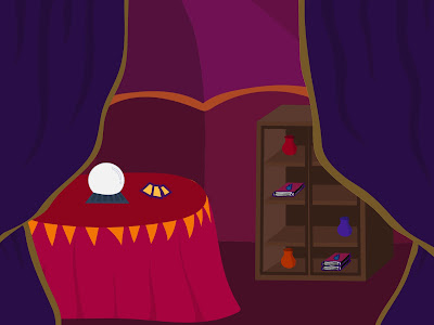
The image below shows my final landscape.
 |
| Figure 2.6 Final Outcome |
After handing it in, I realized some improvements I can make which are adding more gradients and texture to my piece that can help make it come to life. Usually I'm short of time so if I have time I will make improvements and update in my blog submission.
REFLECTION
Exercise 1
For this first exercise, I didn't face many challenges as this is my second semester taking design modules. It was difficult to utilize the shapes for a good body design and I saw some of my classmates had pretty complex designs. The one thing I had to get used to was using a drawing pad and utilizing the knife tool to cut out shapes and form shadows.
Exercise 2
In the second exercise, I found it very difficult to translate my ideas from sketch to the final piece. Somehow, my sketches look better than the final. I'm not used to doing digital art so this is a very ne experience for me. I think what I lack in my piece are shadows, gradients and textures.


Comments
Post a Comment